FITISH / Logo Design & Branding
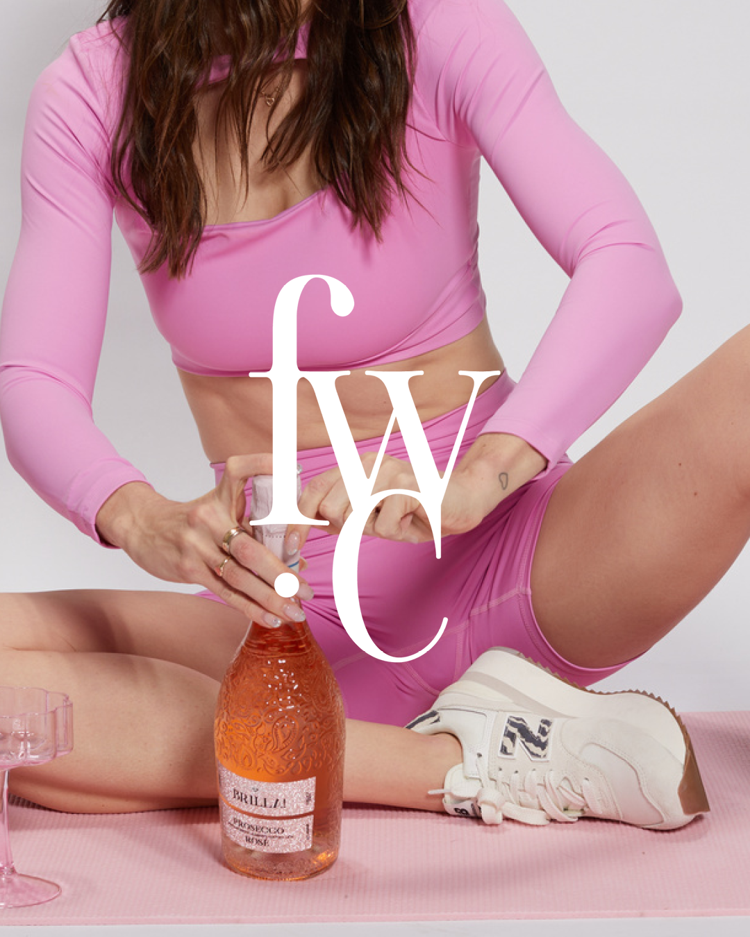
The Fitish brand celebrates balance, community, and the joy of living well. It caters to women in their 20s and 30s who value health and fitness but refuse to sacrifice life’s pleasures. This duality—Pilates by day, rosé by night—is at the heart of the Fitish ethos, and I designed every aspect of the brand to reflect this vibrant lifestyle.
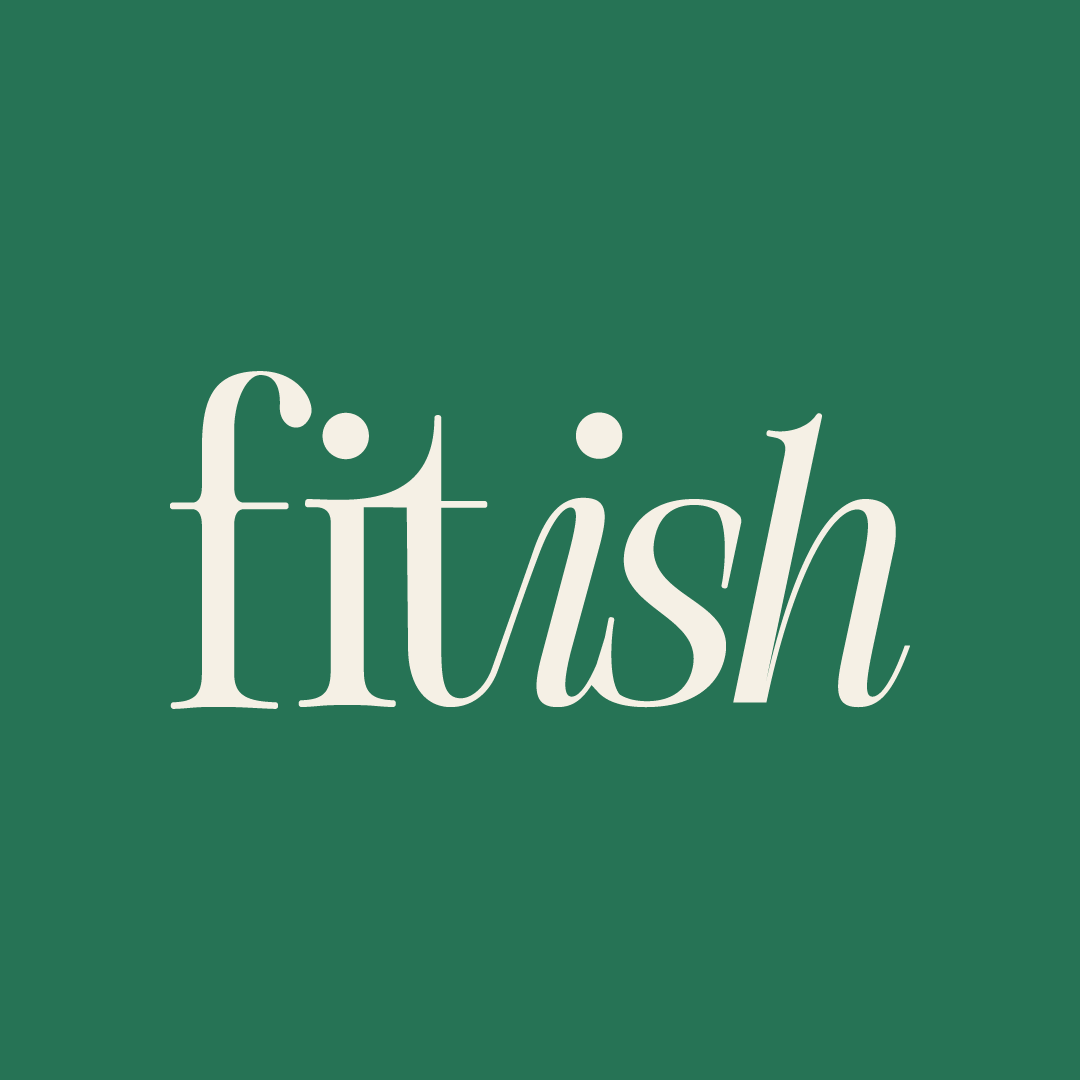
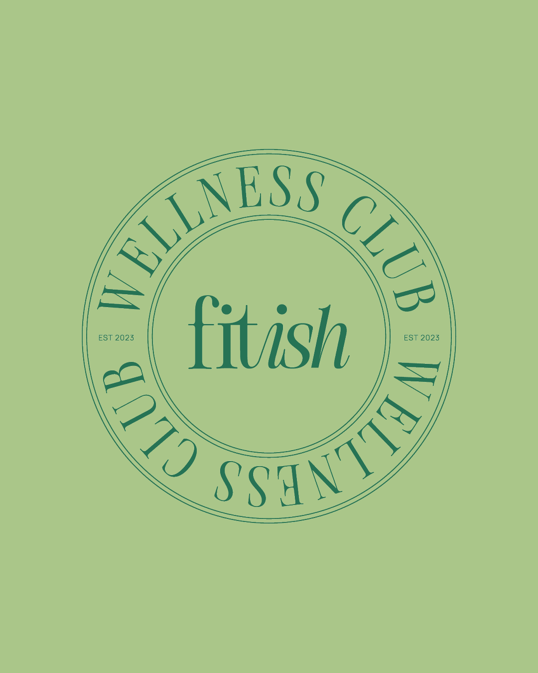
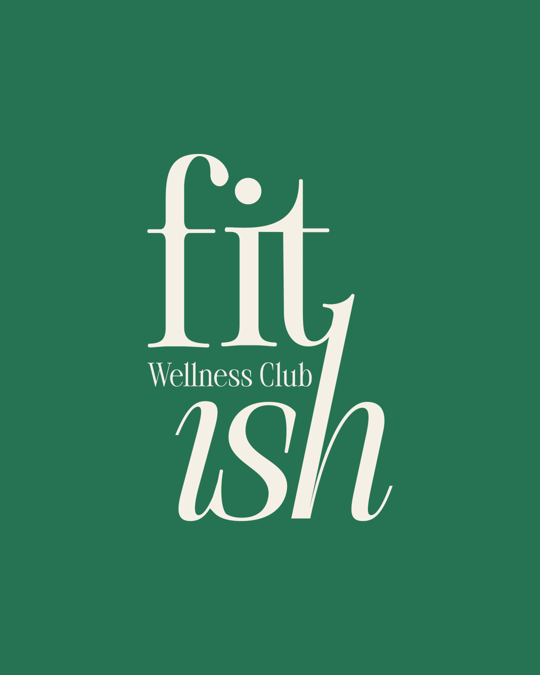
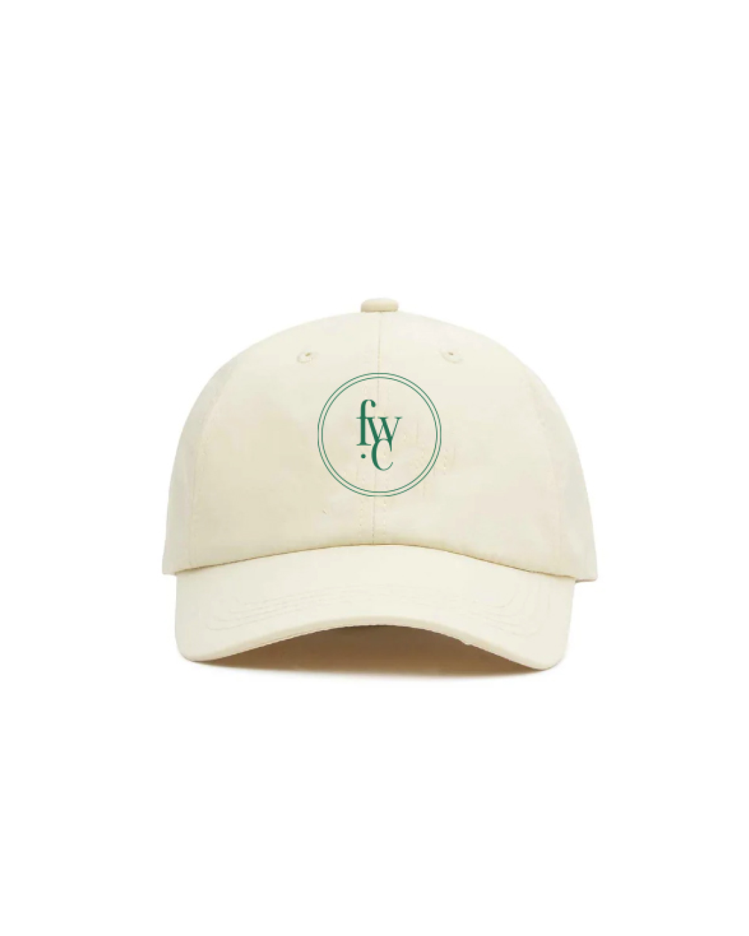
The logo combines a classical serif font with lowercase lettering to convey femininity, nostalgia, and approachability, while the interconnected letters symbolise community and inclusivity. A modern take on preppy aesthetics, the design feels timeless yet fresh, resonating with the brand’s audience.
The colour palette draws inspiration from founder Phoebe's favourite strawberry matcha, blending health & wellness from the greens to the empowering pinks to evoke fitness, fun, and well-being. This harmonious pairing mirrors the target audience's balanced lifestyle while delivering a visually striking presence across print and digital platforms.
Playful layouts, social media templates, and custom illustrations bring the brand to life, while every element—down to the palette and logo—tells the story of a lifestyle that prioritises both health and enjoyment.
You can listen to her podcast here